Albanian Language App
Mobile Design
Designed a mobile language learning app for Albanian, leveraging rapid generative workflows while using current AI tools to enhance early-stage ideation and expanding proficiency in mobile-first interface design.

Project Overview
Client: Personal Project
Tool: Figma, Claude
Timeline: 1 week - 2026
My Role: Product Designer
The goal of this project was to design a engaging and easy to use language learning app for a language that is not very accessible to learn. Since Albanian has few resources available to learn online I wanted to design an app that could be beneficial for all, ranging from those who are looking to strengthen their mother tongue and connect more to their cultural roots or those who are new to the language and interested in learning a unique language as a hobby / in preparation for visiting the country. I am passionate about linguistics and studying languages so I knew this would be the perfect project to expand my skills in mobile designs in addition to integrating AI tools into my design workflow.
Planning
Research + planning included:
research of the most successful language learning apps and how they format their learning experiences
competitive audits of current language learning apps that offer Albanian to determine what they are lacking in terms of UI and the visual aspect, as well as the specific user flows and learning experiences
ideating how to best tailor the user experience specifically for Albanian language learners and focusing the cultural parts of the app for this audience
brainstorming by creation of mood boards and sketches
AI generated wireframes using Claude Design to plan the layout of each page and quickly have a visual for the ideas so far, testing several ideas with the help of AI
Wireframe of the intro page, being the screen the user is greeted with when opening the app for the first time.

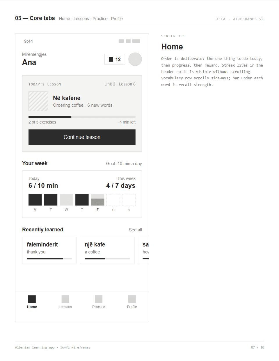
Wireframe for the home page, where the main focus was highlighting what the user should work on next with the bold lesson card at the top. There is also a focus on slightly gamifying the learning process, adding a streak count to the top near the profile image, as well as tracking the amount of practices for the week and recently learned words at the bottom.
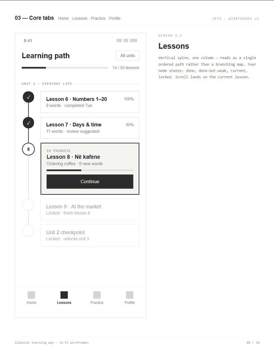
Wireframe for the lessons page where I wanted the learning path to be clearly layed out because it is often important to have a set path for those who may be unsure of what to do next, especially for beginners. There is also the option to view all the units for those who may want to jump around a bit.
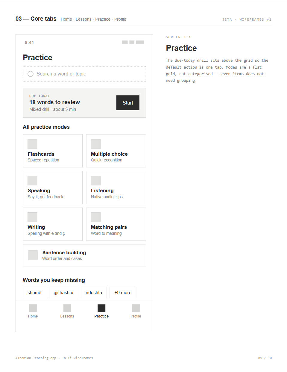
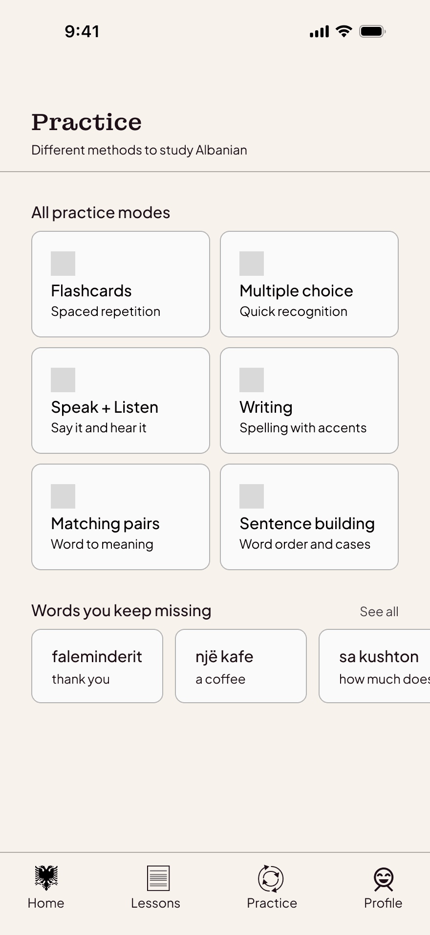
Wireframe for the practice page where I wanted the most important and/or current practice method at the top for the user to quickly recognize what they can do for the day, with all the other practice methods below if the user wants to dive deeper into their study. A handy list of missed words at the bottom also give the user an idea of what they can improve on.
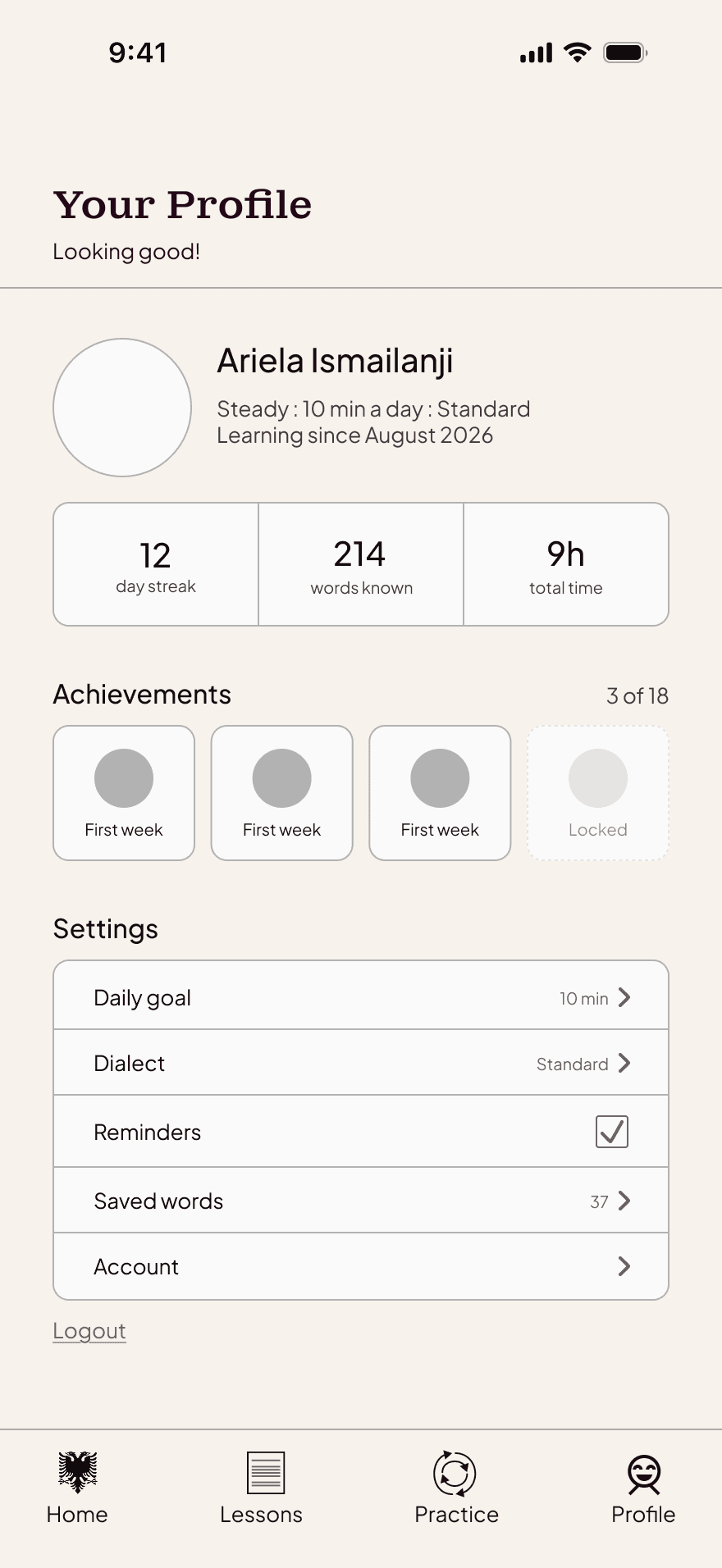
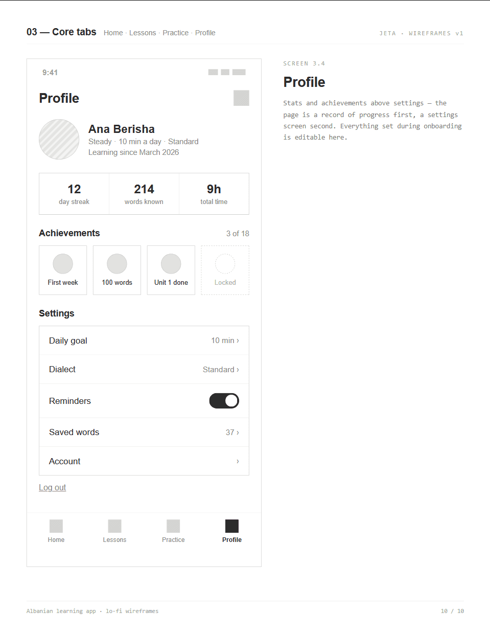
Wireframe of the profile page of the user. A standard page expected in most applications and easily navigable for the user if they want to track their stats or adjust any settings in their learning experience.
Design Solution
In the high-fidelity phase, the visual direction was developed and perfected, focusing on a modern and inviting interface with accents that bring in cultural elements into the design. Along with the modern feel, I still wanted there to be some visually interesting elements that felt welcoming and unique, including differing fonts and sizes, no warm colors, soft borders, and more.
Overall, the main points focused on included:
how to translate the layouts from the wireframes into a cohesive brand identity
designing a smooth and intuitive navigation between various study methods and guiding the user's learning while still allowing them freedom to explore and practice on their own
elevating the cultural elements and relating the app's interface to reflect colors/typography connected to Albanian heritage
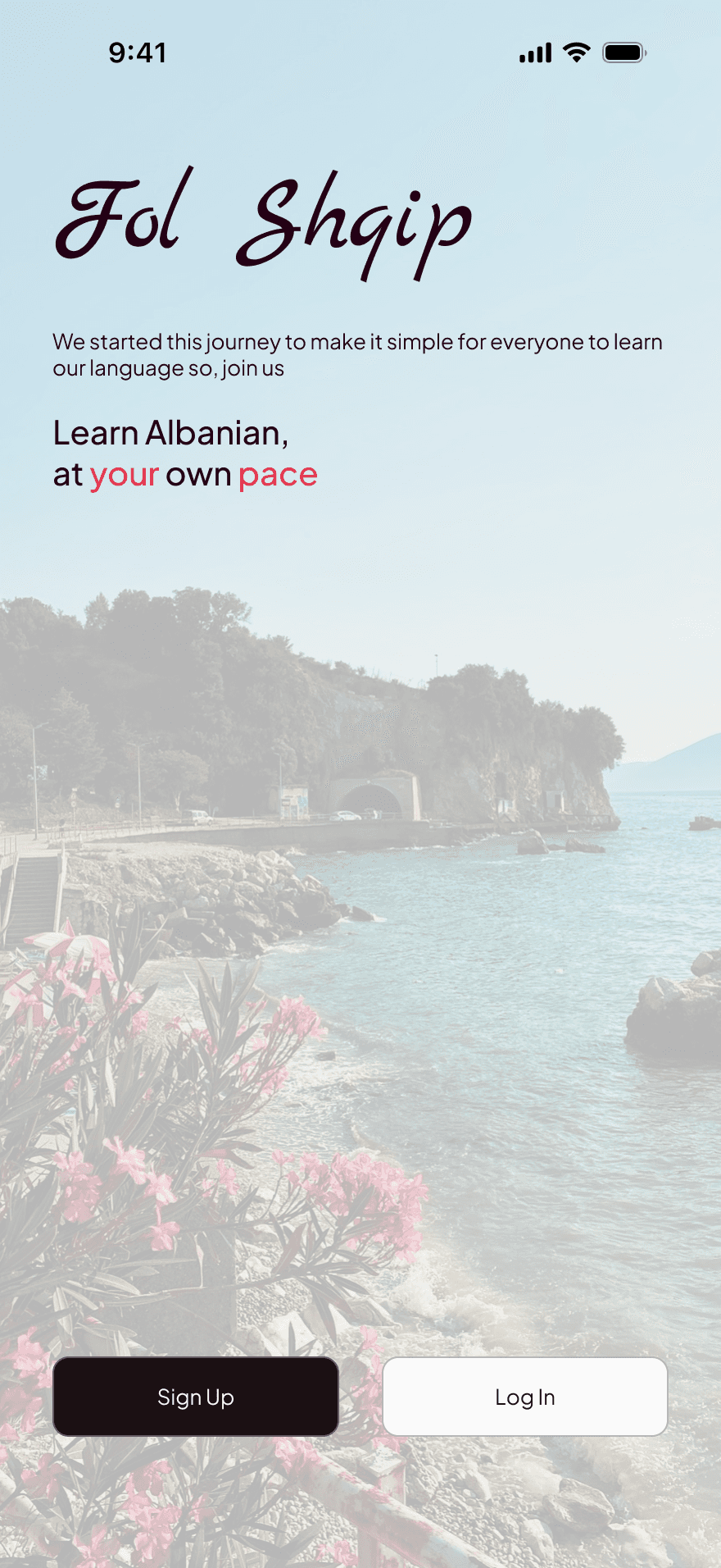
High fidelity mockup of the intro page. Here we can see how inviting the hero image is along with the unique typography and clean layout being modern yet engaging.
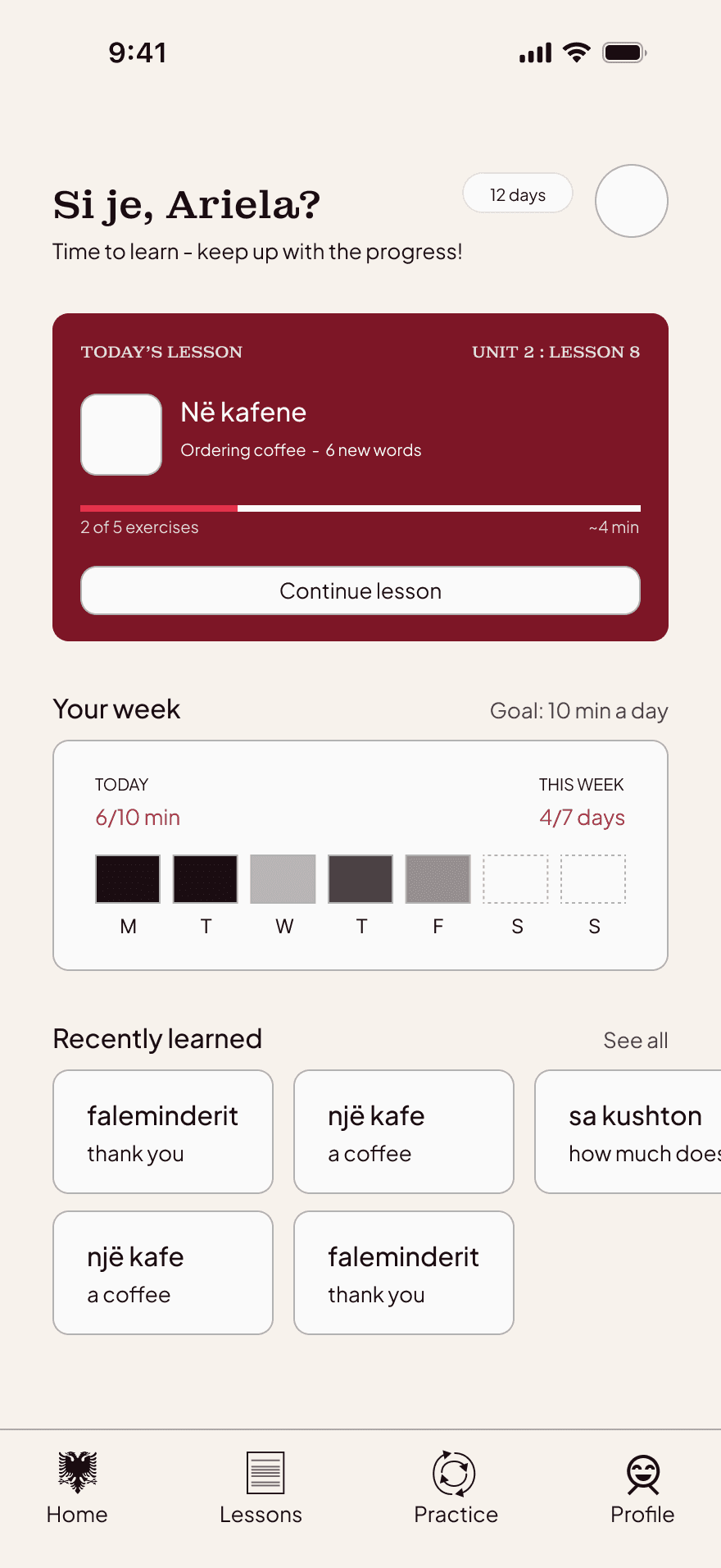
High fidelity mockup of the home page. The most important information is at the top in a bright red (similarly to the Albanian flag which is red and black) accent card, immediately giving the user a quick and easy way to continue their studies. The user's streak and week's stats are visible as well in order to motivate them to keep their progress going. The navigation bar also has unique icons for the user to go between pages, including the double-headed Albanian eagle as the home page button.
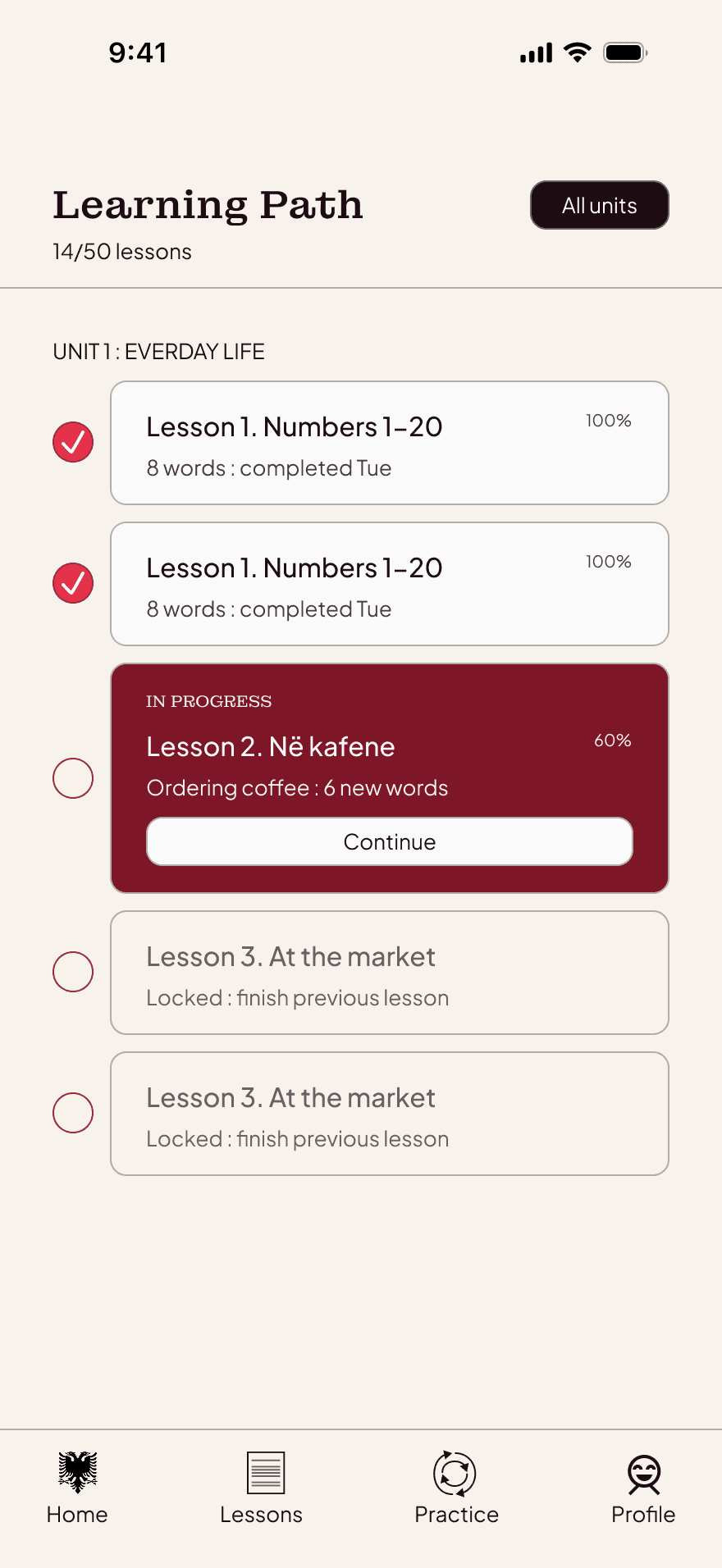
High fidelity mockups of the lessons page. A clear path is shown for the user's learning with the current lesson being highlighted with a red card, previous lessons being visually checked but still visible for the user to go back to, and future lessons providing a preview of what is to come but blending slightly with the background so the previous lessons are emphasized the most. A dark button at the top right provides a clear place for the user to check other available lessons if desired.
High fidelity mockups of the practice page. Similar layout to previous pages so it is familiar to the user and easy to navigate different practice methods.
High fidelity mockups of the profile page. The most important stats are available near the top so the user can see, as well as a clear settings menu at the bottom for any specific changes the user may need.