Art Gallery Marketplace
Visual Design
I led the end-to-end UX design of an engaging digital art gallery that also serves as a marketplace for potential art buyers. I translated loose project guidelines into a cohesive shopping experience for users ranging from collectors to appreciators.

Project Overview
Client: Art gallery
Tool: Figma, Adobe Illustrator
Timeline: 3 weeks - 2025
My Role: Lead Designer
The goal of this art gallery project was to serve as a marketplace for potential customers where all the current artwork in the gallery’s inventory could be listed with all necessary details clearly visible. We aimed to create an aesthetically pleasing and clean design that could accurately highlight the artwork on display, as well as creating an easy to navigate shopping experience for visitors so they can browse uninterrupted.
Planning
Research + planning included:
research of common online shopping experiences and best practices for creating streamlined user experiences
competitive audits of art eCommerce websites and art social medias to develop a sense of what works for this type of experience and what I would need to design specific to this brand
brainstorming by creation of mood boards
wireframes of desktop/tablet/mobile pages to plan the layout of each page and quickly have a visual for the ideas so far
Mood board creation to start the ideation process, focusing on building a brand identity for the website.

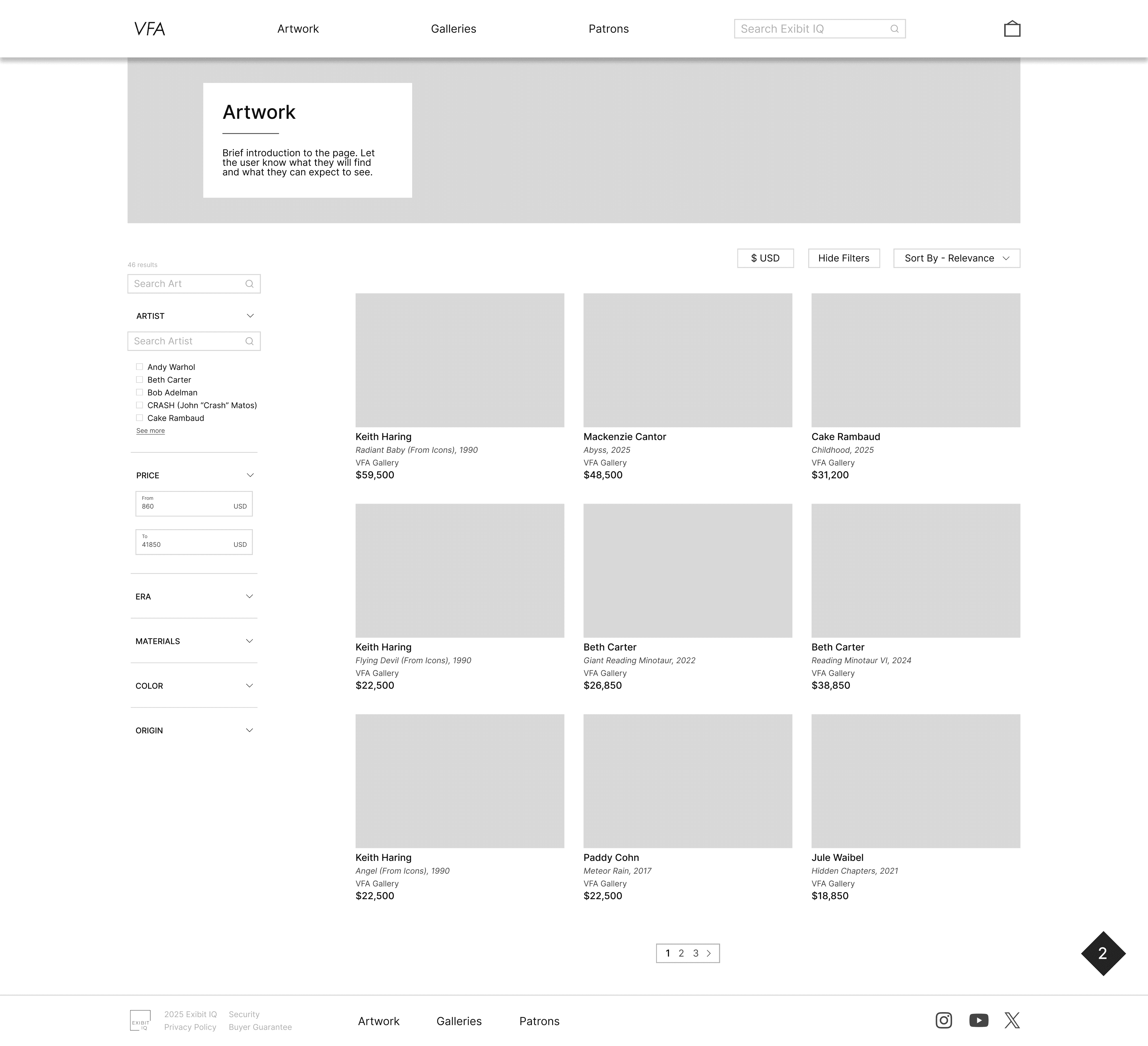
Wireframe for the main artwork page, where I made sure the artwork pieces were all clearly visible and easy to navigate through based on what the user was looking for.
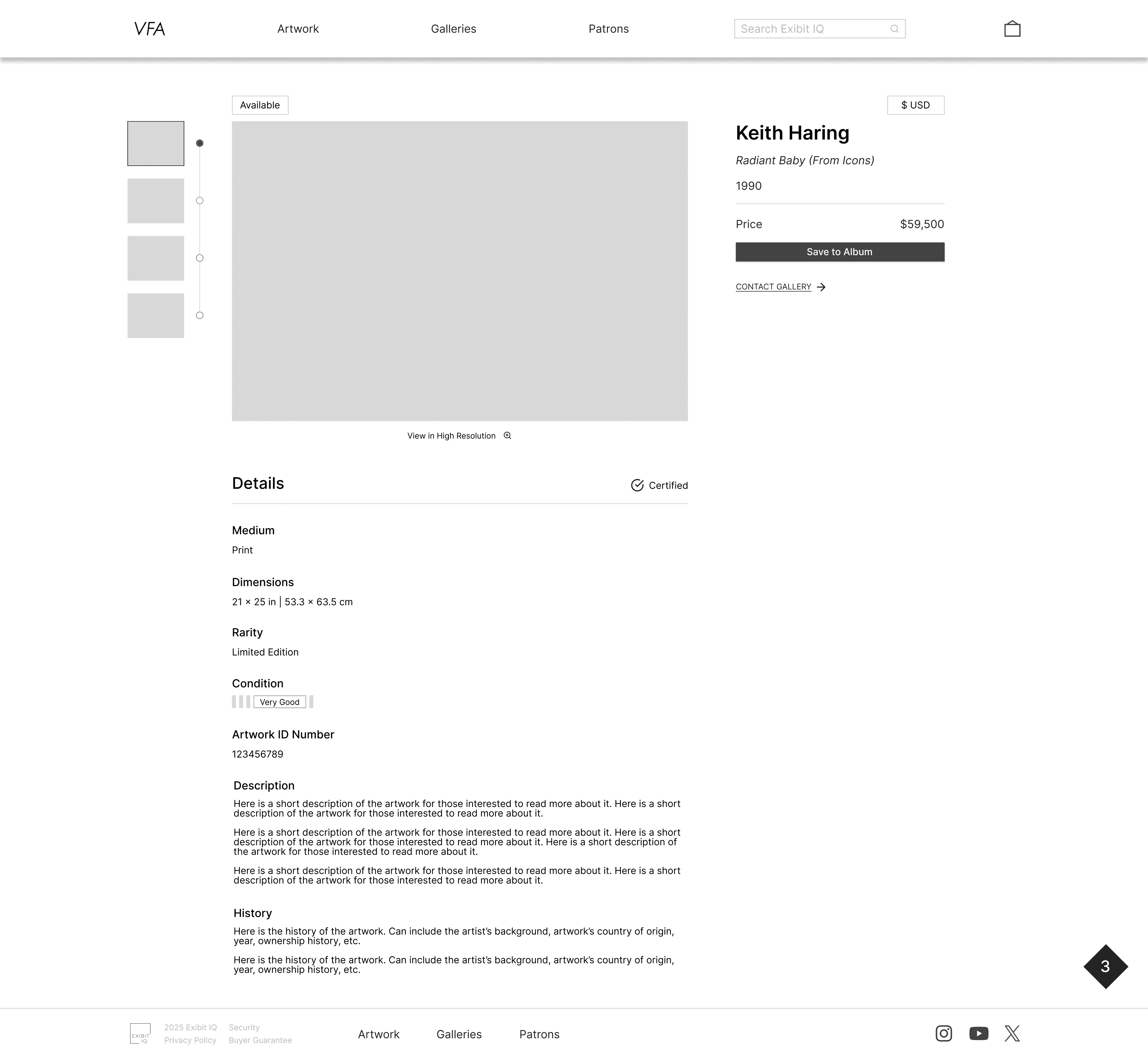
Wireframe for the expanded view when a user clicks on a specific artwork. Here I had to determine what information to prioritize to be visible at first glance for the user, which included the artist name and artwork title, the year the artwork is from, the price, the availability, etc.
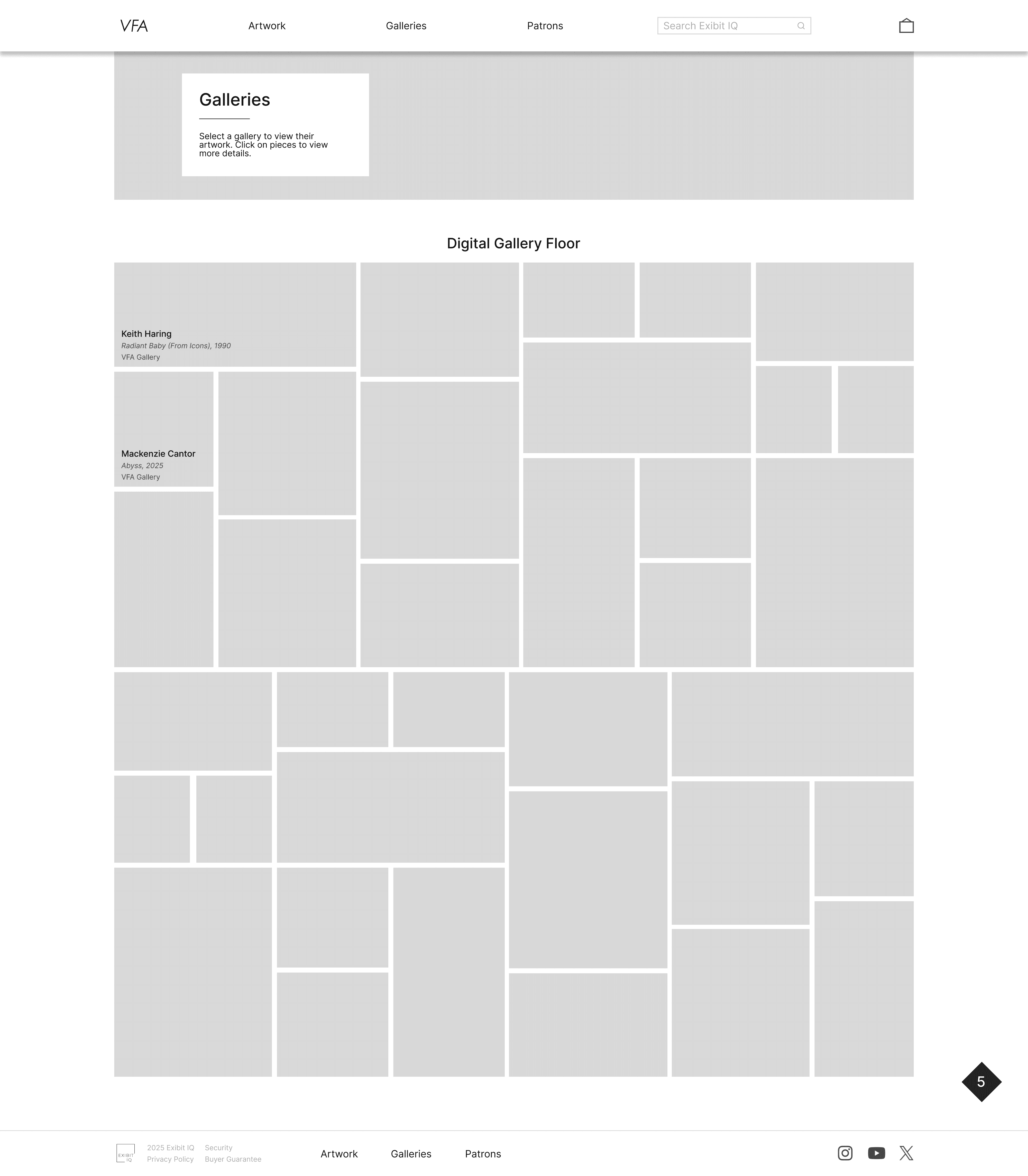
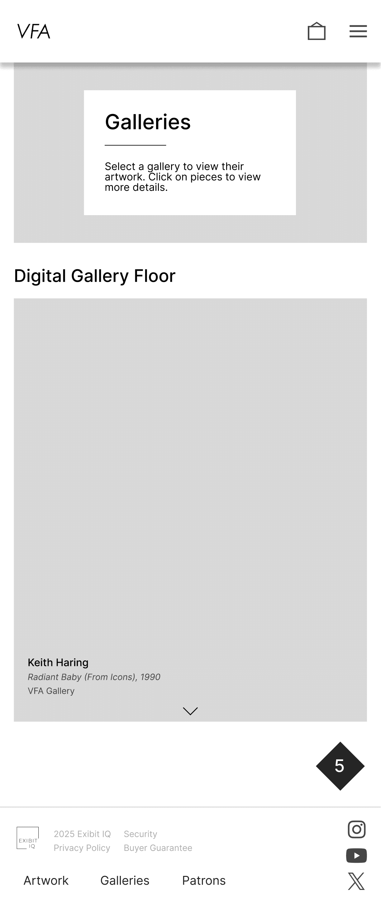
Wireframes for the desktop and mobile view of the digital gallery floor. The challenge here was in designing both in a way that the client's vision of having an immersive yet functional page that evoked a similar feeling to someone physically walking thru an art gallery.
Design Solution
Moving into high-fidelity prototyping, this part was when the vision really started to come to life, and the aesthetic direction became more clear. The main point was to properly highlight the artwork so adding the extra details such as typography, images, colors, banners, etc. I could see this all come together.
Overall, the main points focused on included:
how to translate designs from desktop to mobile
creating a seamless experience on each screen between the different pages
elevating the brand identity and making it shine to showcase the art on display
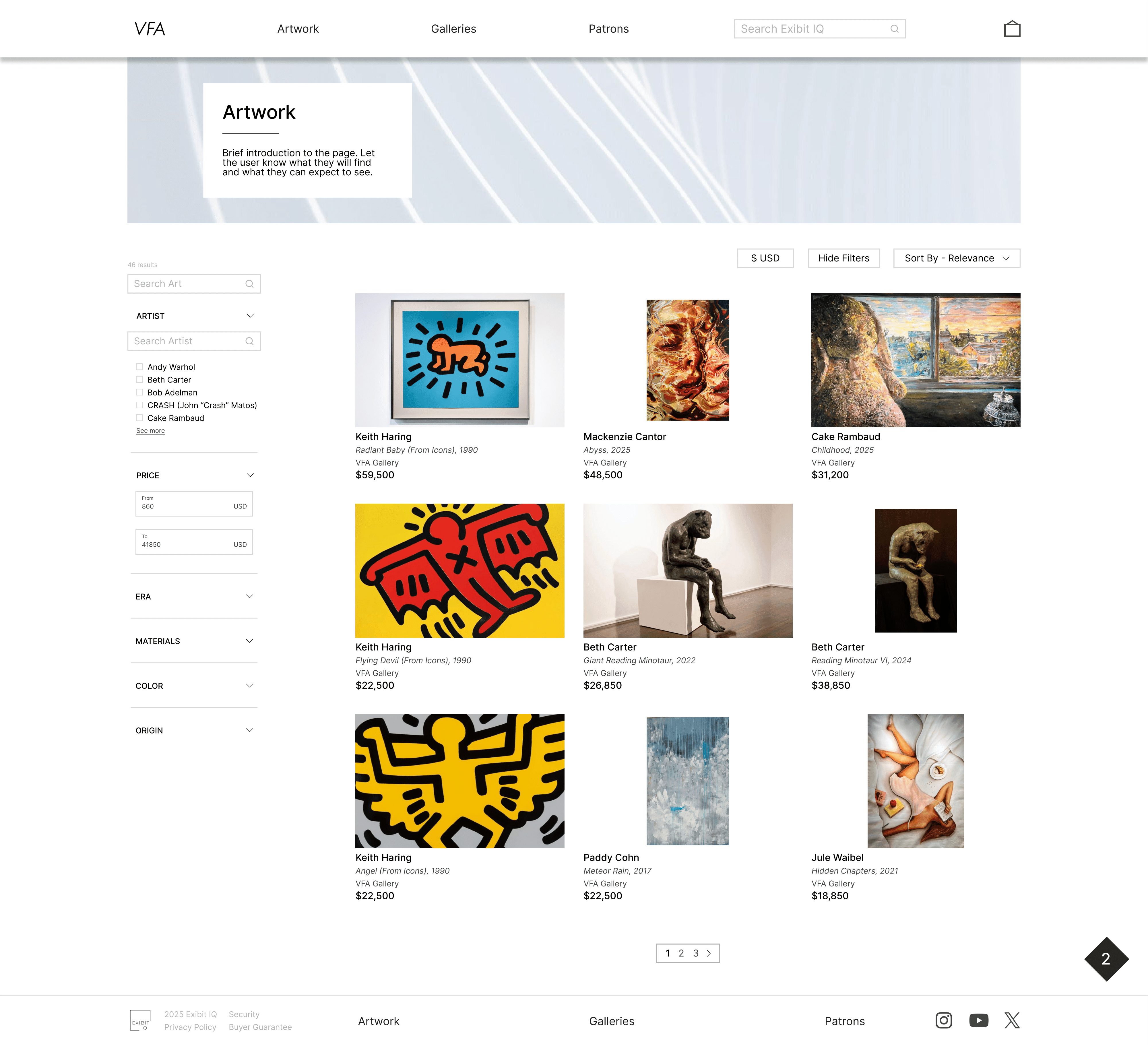
High fidelity mockup of the artwork page. Here I was able to really see how the artwork is easily viewable for the user and they are able to select them based on specific criteria.
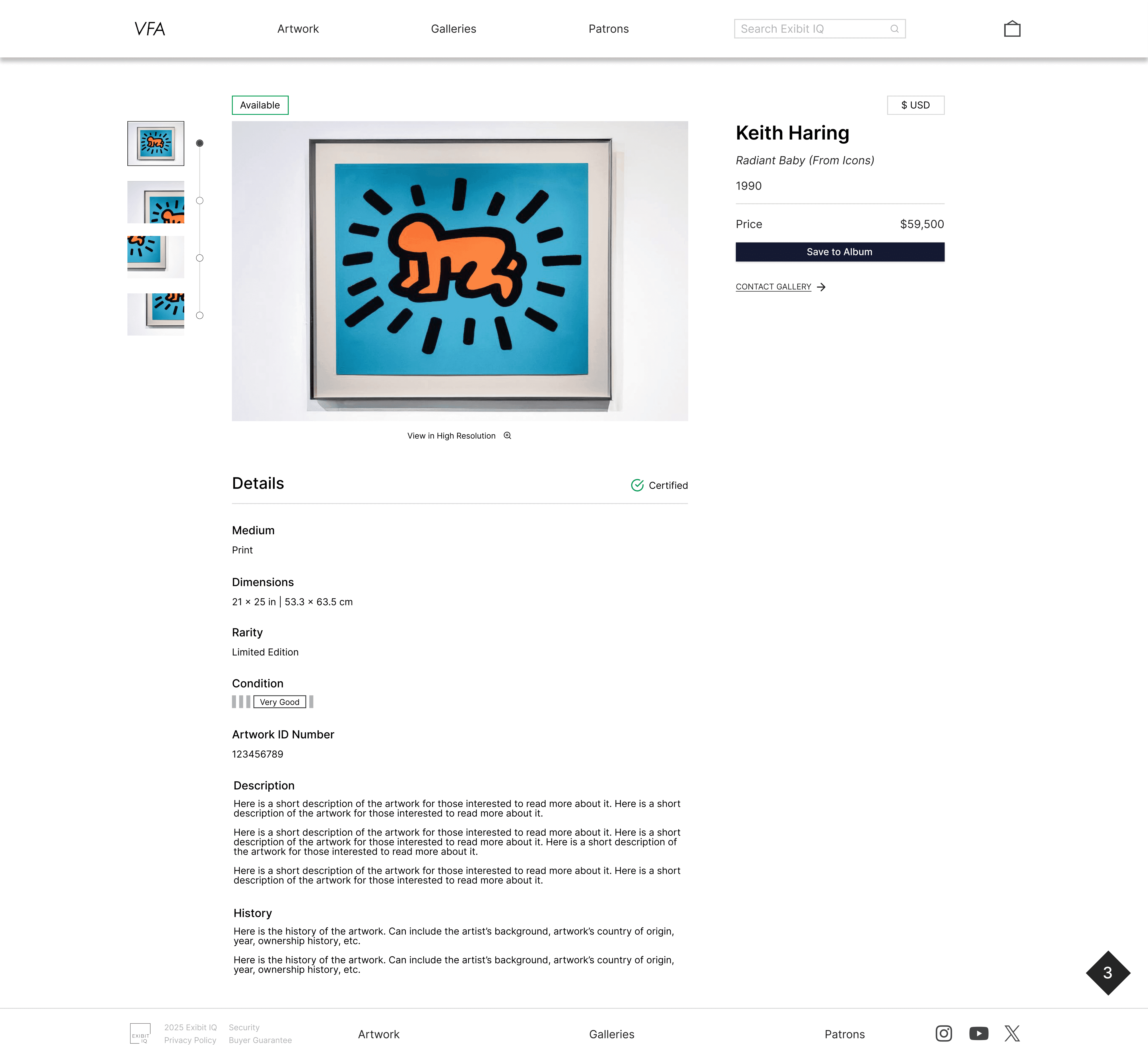
High fidelity mockup of the expanded view when clicking on a piece of artwork. The availability badge is highlighted to signal quickly to the user the status of this artwork, as well as having a certified badge visible and all the most important information is easily seen by the user at first glance.
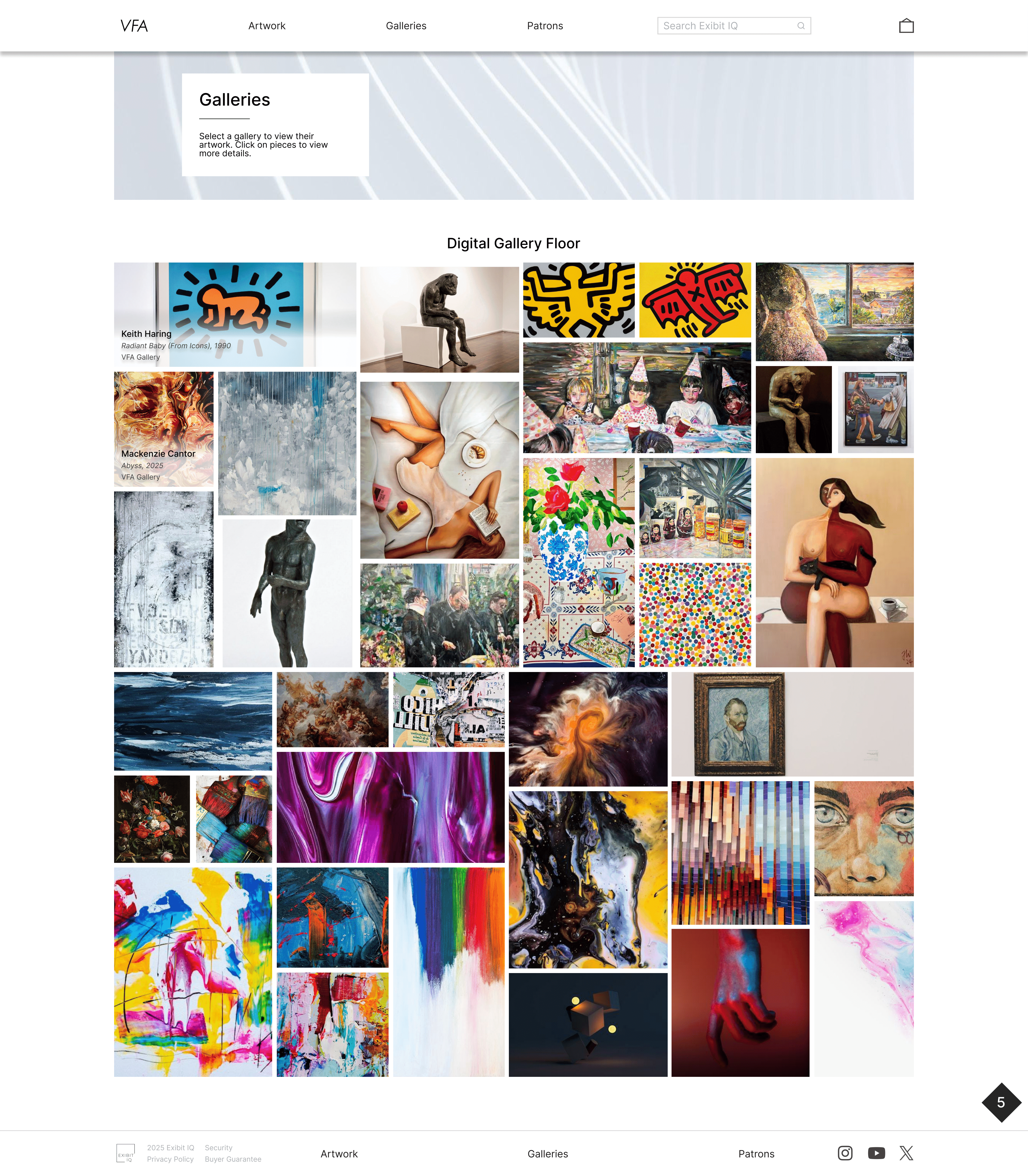
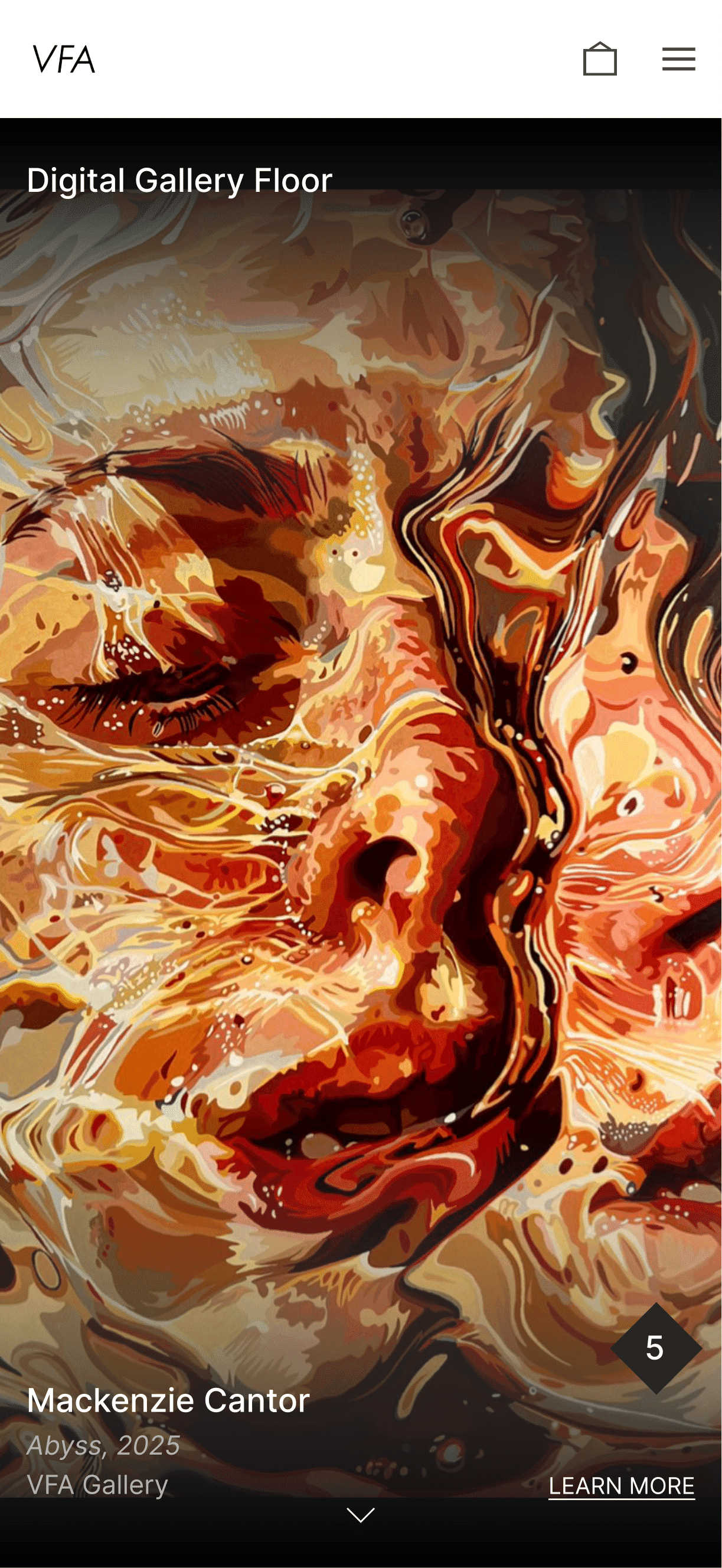
High fidelity mockups of the digital gallery floor on desktop and mobile screens. The immersive feeling comes to life with all the artwork visible here and the way I translated that to mobile was through a scrolling feed, similar to an art social media app, whereas on desktop there was more room so the collage grid layout worked better and provided similar but unique experiences for all users.