Admin Dashboard
Interaction Design
To streamline operations of an art gallery and be able to quickly surface important metrics easily, I designed the interface of an admin dashboard that the client could use to view their inventory, manage artist and patron profiles, track gallery analytics, and more.
Project Overview
Client: Art Gallery
Tool: Figma
Timeline: 4 weeks - 2025
My Role: Lead Designer
This admin dashboard was designed to streamline the operations of an art gallery and quickly surface important metrics about the business as needed. The goal was to create a dashboard that keeps all the necessary information at the forefront while also allowing for thorough management of a gallery’s artwork inventory, patrons, and analytics. It is meant to be easy to read and organized enough to contain large amounts of data.
Planning
Research + planning included:
researching examples of how to best incorporate large amounts of different types of data into a dashboard that is easily manageable
documenting the information architecture and layout of the entire site to ensure an organized design process
focused on the main pages first and went in depth as the general structure was outlined
wireframes to visually determine the layouts of each data table
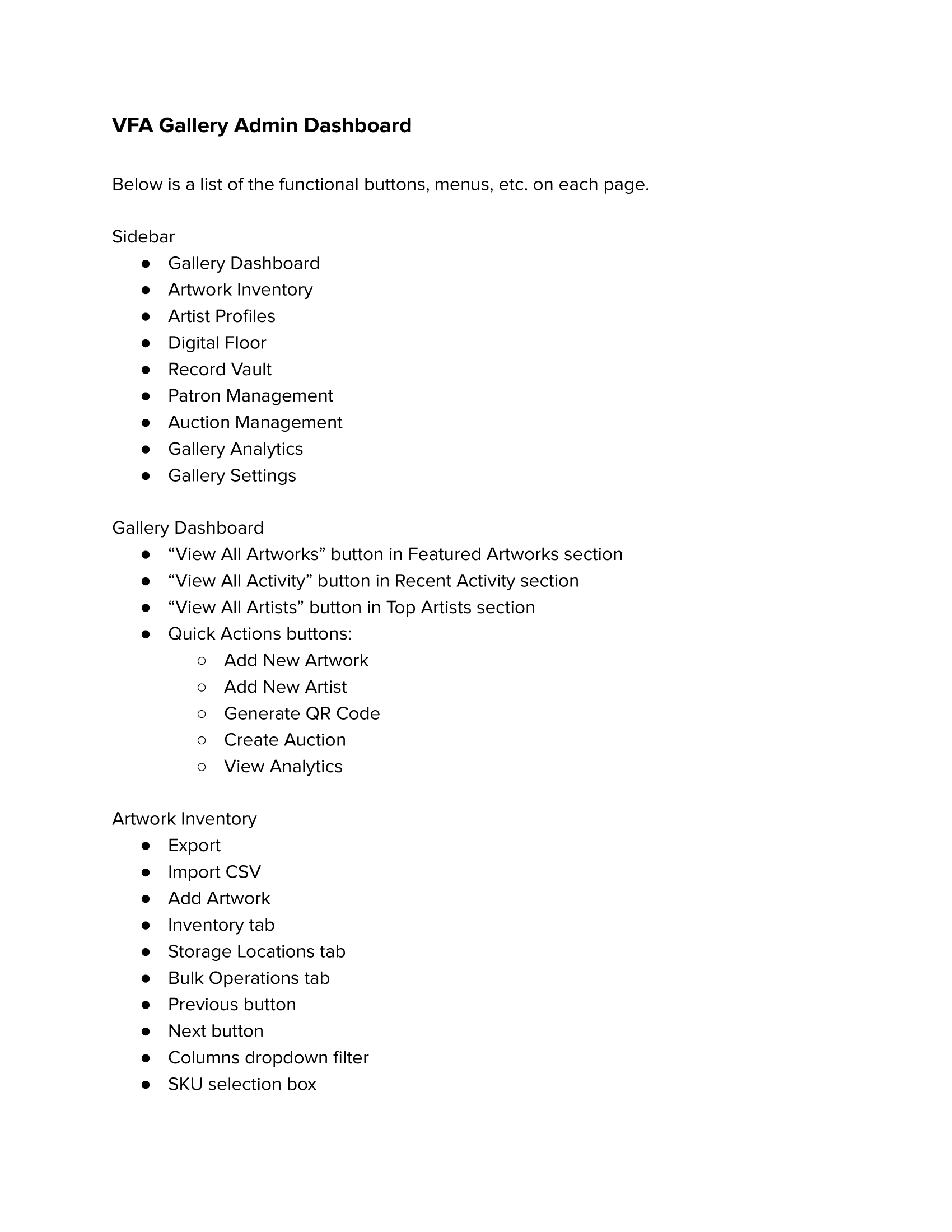
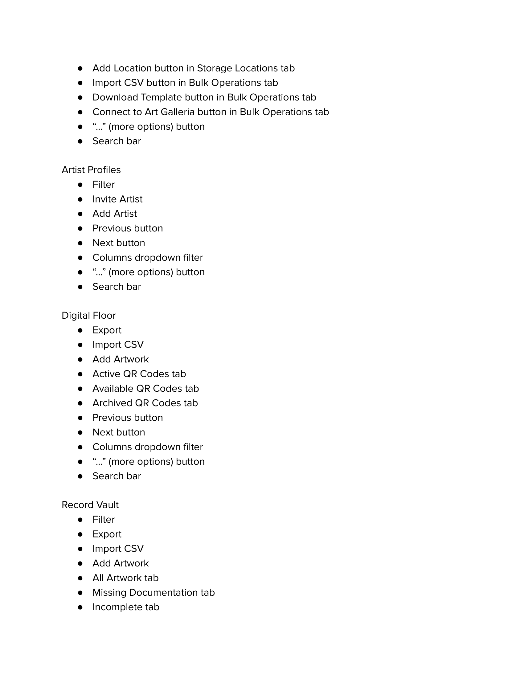
Documenting all the functions and features on each page to prepare for testing and ensuring that all user flows are intuitive and working as intended.
Design Solution
Moving into high-fidelity prototyping, this part was when the vision really started to come to life, and the aesthetic direction became more clear. The main point was to properly display the important information and so I used bolder text, highlighted cards, specific colors for the tagging of artwork, and clean table layouts.
Overall, the main points focused on included:
ensuring the site would be helpful and intuitive rather than a burden to use
making it easy to navigate and find where all the major details and features were
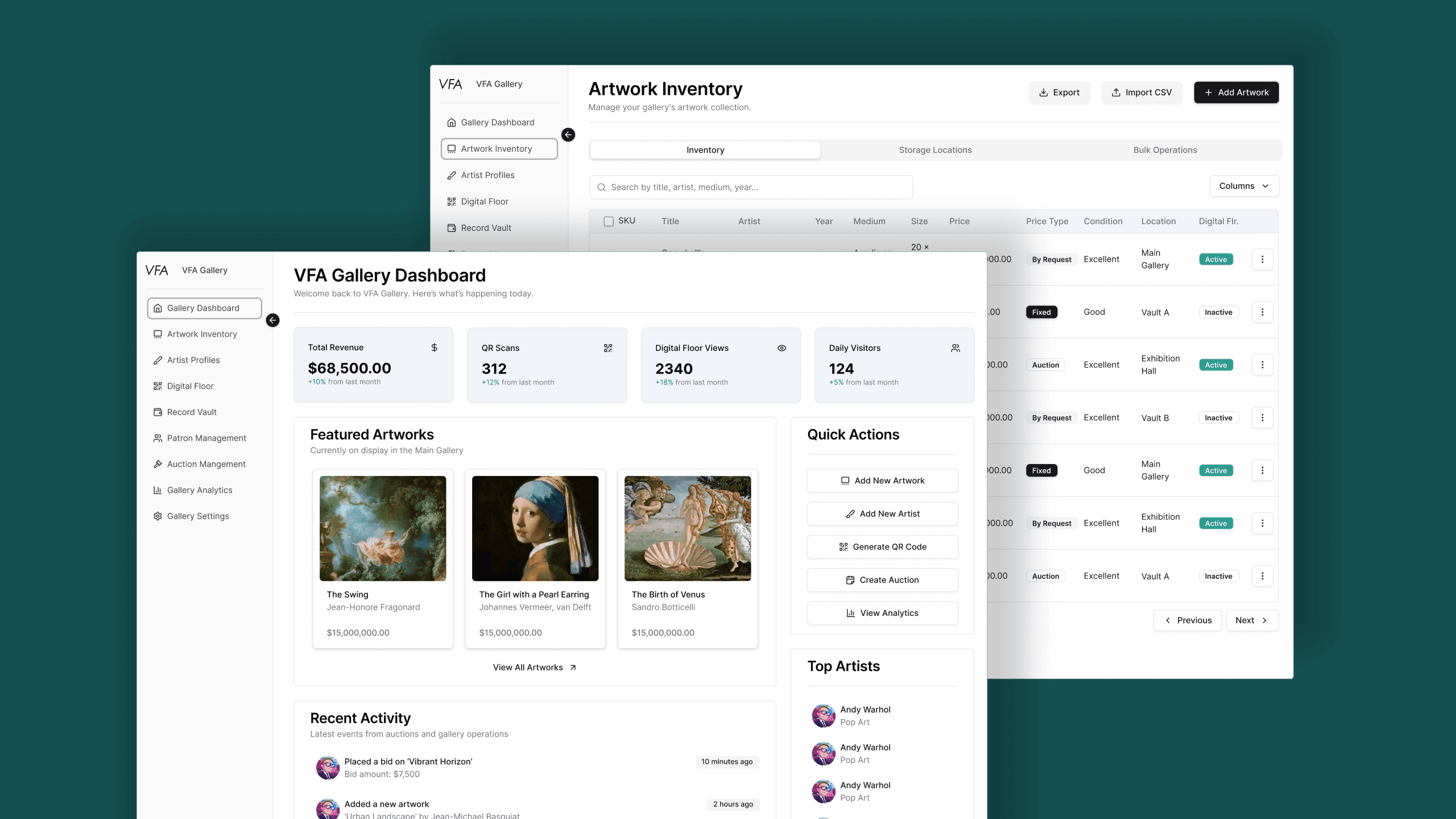
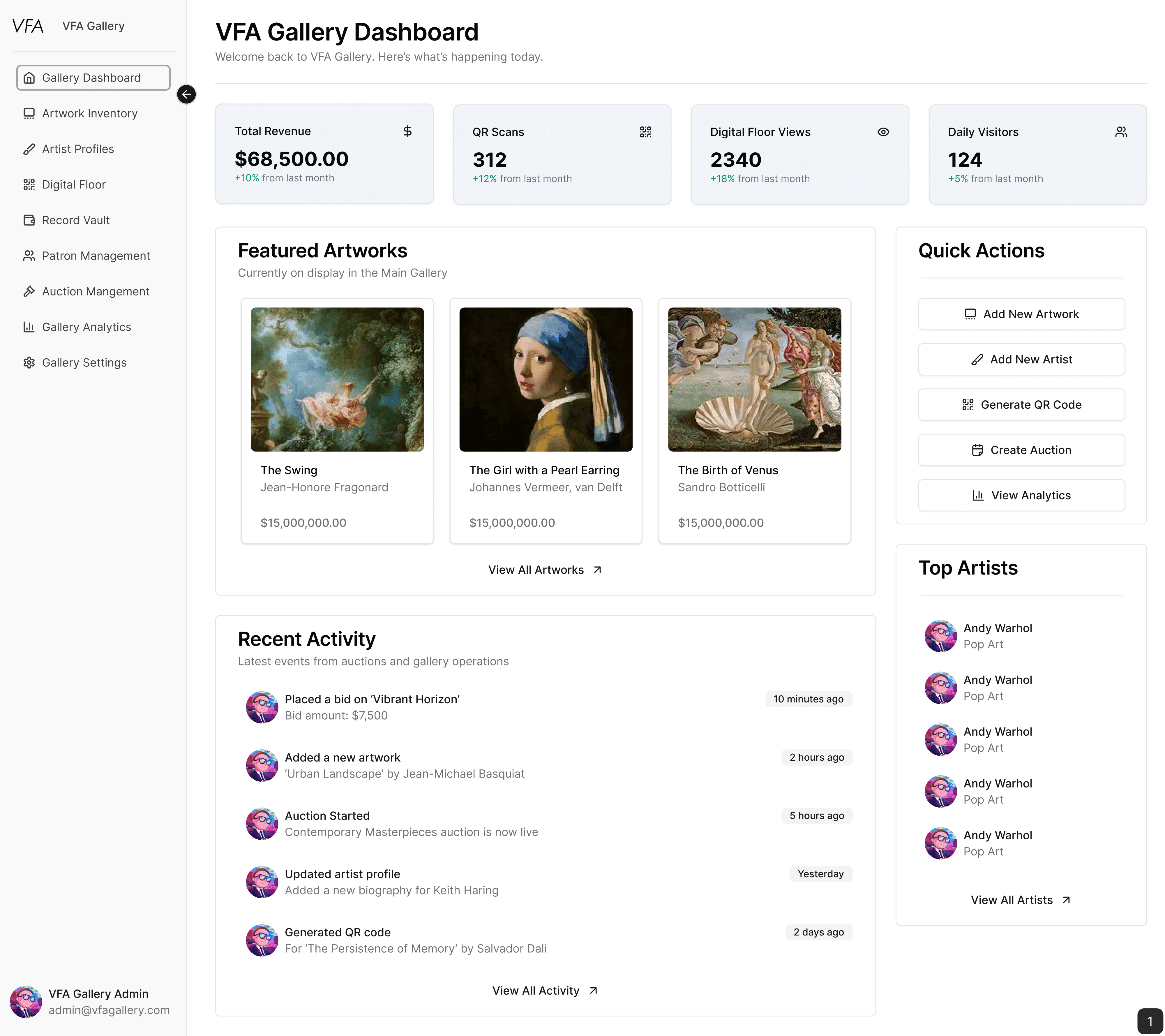
High fidelity prototype of the gallery dashboard page where the most pertinent information needs to be visible with a quick glance, such as the stat cards at the top of the page and all recent activity being easily viewable to the user.
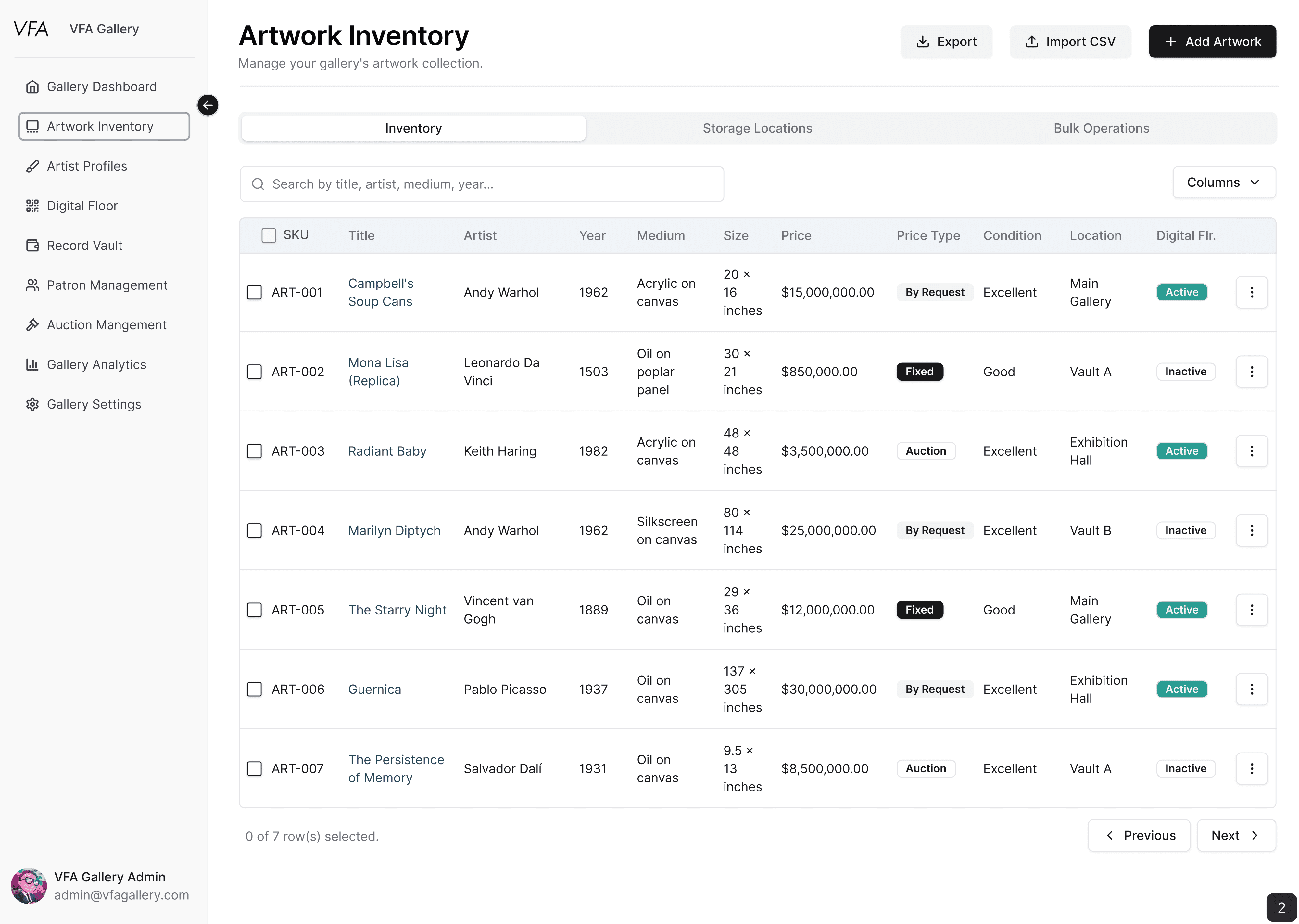
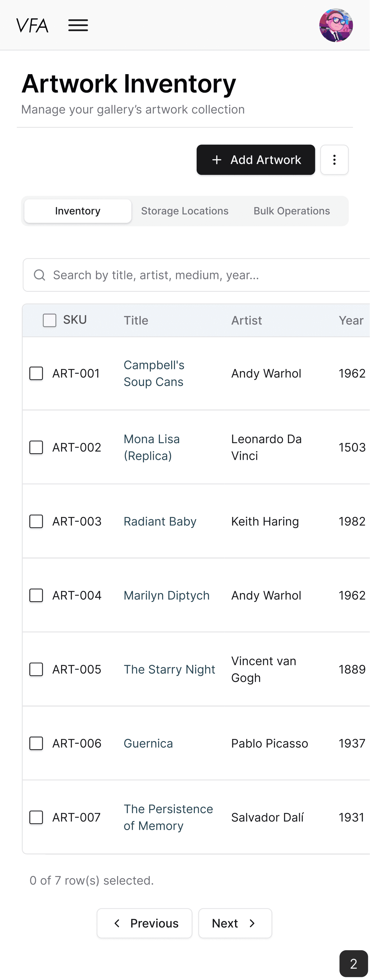
High fidelity prototype of the artwork inventory page. This was quite a challenge to determine how to best display a dense amount of information, as well as ideating how to best translate the desktop view to a mobile view. The mobile view worked well because it was easy for the user to keep track of the row they were looking at while still viewing all the information they needed by using the horizontal scrolling.
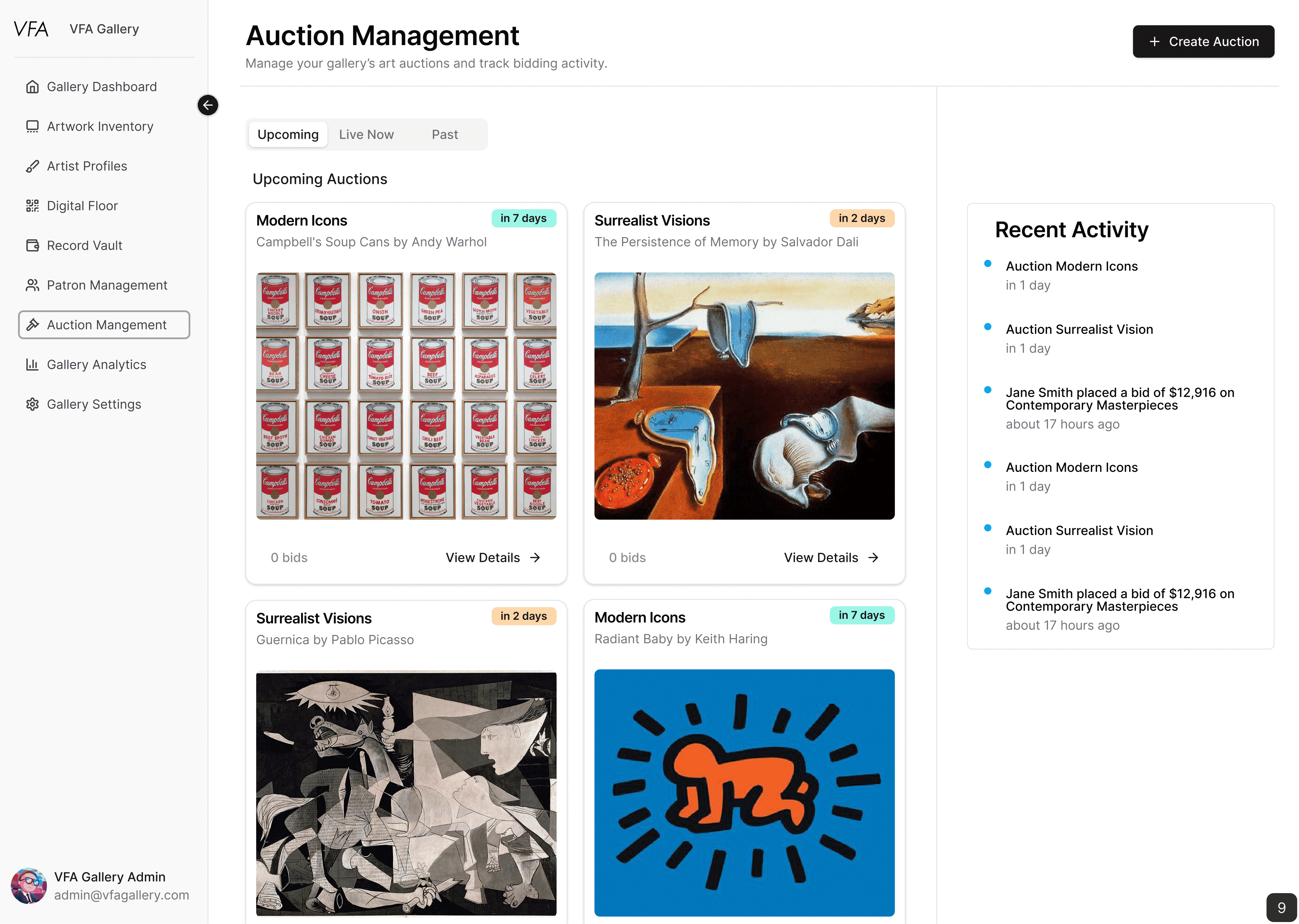
High fidelity prototype of the auction management page. Visual cues such as the time badges help the user to quickly understand and visualize a timeline of the latest auctions while the most recent activity is easily accessed in a notification section on the side.